Matplotlib[]
A plotting and graphing library for python that does everything wierd thing you could ever possibly want. It also comes with a useful matlab-like interface called PyPlot.
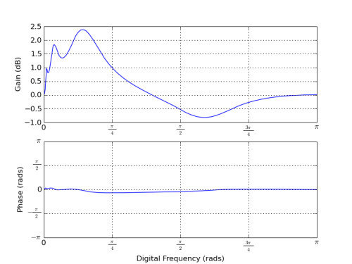
Beautiful Bode Plots In Matplotlib[]
Try this function.
import math
import matplotlib.pyplot as pyplot

# frequency in Hz, gain in dB, phase in radians between -pi and pi. They should
# all be vectors of the same length.
def bode(frequency,gain,phase,frange=None,magrange=None,title=None,**kwargs):
    pyplot.figure()
    pyplot.subplot(211)

    # add title, if given
    if (title != None):
        pyplot.title(title)

    # plot it as a log-scaled graph
    pyplot.semilogx(frequency,gain,basex=10,**kwargs)

    # update axis ranges
    ax = []
    ax[0:4] = pyplot.axis()
    # check if we were given a frequency range for the plot
    if (frange != None):
        ax[0:2] = frange
    # check if we were given a dB range for the magnitude part of the plot
    if (magrange != None):
        ax[2:4] = magrange
    pyplot.axis(ax)

    pyplot.grid(True)
    # turn on the minor gridlines to give that awesome log-scaled look
    pyplot.grid(True,which='minor')
    pyplot.ylabel("Gain (dB)")

    pyplot.subplot(212)
    pyplot.semilogx(frequency, phase,basex=10,**kwargs)

    # update axis ranges, we know the phase is between -pi and pi
    ax = pyplot.axis()
    if (frange != None):
        pyplot.axis(frange + [-math.pi,math.pi])
    else:
        pyplot.axis([ax[0],ax[1],-math.pi,math.pi])

    pyplot.grid(True)
    pyplot.grid(True,which='minor')
    pyplot.xlabel("Frequency (Hz)")
    pyplot.ylabel("Phase (rads)")

    # nice LaTeX pi scale for the phase part of the plot
    pyplot.yticks((-math.pi,-math.pi/2,0,math.pi/2,math.pi),
               (r"$-\pi$",r"$-\frac{\pi}{2}$","0",r"$\frac{\pi}{2}$",r"$\pi$"))
And an example of use:
bode.bode(f,gain,phase,
          title="Bode Plot of Notch Filter (measured)",
          marker='.',
          color='r',
          linestyle='-',
          grange=[-25,5])

A totally kickass notch filter
The response of a 5-band digital EQ